Welcome to the #13 MTG artists interview series, 'There's no Magic without art'.
Today we have the pleasure of sharing with you our interview with Craig Spearing, whose first card debuted four years ago.
Hi Craig. How did you start working on Magic, and what was the first card you made?
It was a long winding road. I went freelance in '95, illustrating for the children's educational field until '08. Most of my work was historical, focusing on Westward expansion in the 1800s: lots of cowboys, Native Americans, and pioneers. But through all that time in the children's field something inside me, not of this world, was clawing to get out.
Around '03 I started painting the things I loved to draw as a kid: dragons, demons, elves, and orcs. Over the next few years I moonlighted a new portfolio of fantasy images. Unencumbered by historical accuracy, it was like stepping into a wonderfully weird new world where anything was possible.
My work was in entirely traditional mediums, then I made the jump to digital in '08. Sarah at Paizo, and Jon and Kate at WotC gave me my first gaming assignments, and I still enjoy working for Pathfinder and D&D today. I finally found the courage to submit a portfolio to Magic in '13. Jeremy and Dawn took a chance on me, and my first card was - Victimize for Conspiracy.
Were you familiar with the game at the time?
Yes... and no. I had a small collection of cards by favorite artists, and I went to a few GPs to visit artist friends, who encouraged me to submit a portfolio to Magic. I was (and still am) blown away by the amazing images in the game, but I'm embarrassed to say I still have no idea how to actually play it.
One of these days I need to sit down with a very patient player, bribed with their choice of food and drink, to teach me the basics. My only concern is my obsessive nature, if I learn to play I'll end up inevitably collecting eighty gazillion magic cards.
Can you give us a brief description of your painting process?
It starts with little scribbles, two or three thumbnails with no detail, focusing on the whole composition. I pick the one that flows the best and start blocking in lights and darks, making a rough value map. Then I noodle in and refine the details until it looks like an almost finished painting in grayscale.
With most of the variables locked in, this makes the final color painting go a lot smoother. I layer on the color slowly, much like oil glazes, being careful to retain the value dynamic of the grayscale base.
Bomat Courier is one of the most popular cards in the game right now. How did this card come to be?
Initially I envisioned the construct smaller, with a propeller on top like a beanie, buzzing through crowds. Cynthia, the art director, pointed out that the card didn't have flight ability (this is why I need to learn how to play the game).
So we revised the sketch to have the construct rolling on the ground, and eliminated the crowds to bring more focus to the Courier. I never know which cards will be popular with players, so I approach all assignments as equal, and do the best job I can on every one.
What cards were the most challenging to paint, and why?
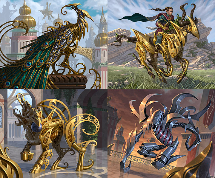
Kaladesh. The layers of brass filigree, gears, wires, pistons, mechanical joints, and Kaladeshy gizmos were incredibly challenging to paint, and also incredibly time consuming. I got sucked into the details, and it was difficult to know when to stop fiddling with 'em.
Deadlines are usually what stopped me, but the final images all looked kinda overworked. I think it was Michael Whelan who said (and I'm paraphrasing here)- "It takes three people to make an illustration: one to paint it, one to art direct it, and a third to point a shotgun at the illustrator to keep him or her from overworking it". I'm a compulsive detailer, Kaladesh fueled that compulsion.
A more skilled illustrator can depict a mechanical construct with broad painterly brush strokes without getting bogged down in the details. I don't have that level of skill.

Were you aware of the 'Hit him with your crossbow Steve!' joke regarding your - Octopus token? How do you react when fans get creative?
I think it's hilarious! My intent with the tiny adventurers was just to show a sense of scale compared to the giant octopus. Obviously I didn't give much thought to how useless it would be aiming a crossbow at a creature that massive.
At a recent Grand Prix I made little comic book dialog bubbles out of Post-Its that said "Hit him with your crossbow Steve!" and stuck 'em on the sleeves for that print. A lot of players thought that was funny, and I was happy to keep the joke rolling.
Three new cards of yours from the upcoming Core 2019 were just spoiled. Did you enjoy working on them?
Definitely! I struggled with the color palette on Gallant Cavalry, but the whimsical feel of flying cucumbers and a baby dragon splashing around in lava on Volley Veteran Sarkhan's Whelp were a light hearted change of pace from work that's usually darker in theme.
Admittedly, I made that little dragon as cute as possible. Electrify was also reprinted for Core 2019, it's always nice to see an older card pop up again.
Can you name some favorites among the art you've made for Magic?
It was fun turning an army into blue frogs for Polymorphist's Jest. The simple bold compositions for Seeker of the Way, Opt, and Vampire Champion read well at card size (something that took a while to learn).
And I really liked the gothic horror of Innistrad, I wasn't working for Magic yet when Innistrad first came out, so when they revisited that plane later it was exciting to be part of it.
Solitary Hunter and Might Beyond Reason were my favorites from that set, not heavily played cards, but I loved painting the images for those.
Where can our readers find you online and learn more about your work?
Readers can find me at craigspearing.com or on Facebook. Also, I attend two or three GPs a year for in-person interaction with fans of the game.


